RapidReviews: Wayne Goss’s New Weightless Veil Blush Palettes

Clock-wise from top-left: Coral Rose, Vivid Azalea, Blush Peony
First of, I have to admit up front that I am a massive fan of Wayne Goss, the person (or at least the impression I have of his person via youtube). Before I ever knew that he had a beauty product line, I was watching his videos on you tube and loving them. He appeared and still appears utterly disarming, funny, kind, and deeply authentic in a takes-himself-with-a-pinch-of-salt kind of way where you feel that you want someone like him to be a part of your industry/workplace because they would just make everyone arounf them kinder and more genuine. So with that said, I wanted to quickly review his latest launch - his blush palettes. Although I know I am a little delayed reviewing these, I really wanted to test them for some time before talking about them just to make sure that my own personal bias in his favor was not coloring my objectivity. And my conclusion? These blush palettes are real performers. The color, the longevity, the effect on the skin? Check, check, and check.

There are 4 blush palettes in this collection and I ordered 3 out of those (I thought the 4th one may be too dark on my skin tone). They come in a dark brown, weighty case that’s very minimalist and chic and feels nice and solid in my hand. While I wouldn’t necessarily say that they look exceptionally large in size, they do come with a lot of product. Each palette has one blush and one highlighter and according to Wayne Goss can be used together or seperately. I like my matte blushes matte and my highlighters to not look like blushes, so I use these seperately but instagram and youtube has lots of reviewers trying these on together and I have to admit, the effect is beautiful.
The Formula
The blushes are fast becoming an every day staple for me because the of the magic formula of these palettes. While they look super pigmented in the pans (and probably are), when I apply them using a fluffy or even a dense brush, they go on lightly and diffuse beautifully, making them a blending novice’s dream. The blush formula is super silky to the touch and looks almost airbrushed when applied to my cheeks. It doesn’t emphasize texture, it has a slight blurring effect, and it lasts and lasts and lasts. I kid you not - I wore it all day in humid weather and it did not budge.
The highlighters have a more buttery formula that feels almost creamy to the touch. These highlighters have no glitter or shimmery sparkles - they are more metallic in how they look on my face - a muted metallic that makes them subtle for metallic lovers, but definitely high-powered for those used to truly subtle or barely-there highlighter formulas. They end up imparting a noticeable sheen to my cheekbones.
While I like the highlighters, the blushes in these palettes have my heart and standout in this collection.
The Colors

Sweetened: The blush in this palette is a perfect light-medium pink leaning more cool-toned and more pink in natural light, and warmer and slightly peachier in indoor, yellow light.
Shimmer Pink: The highlighter is very pale pink, almost bordering on white. The swatches makes it look more powdery and white-er than it is when applied on the cheek where it comes off with a strong pale pink metallic shift.
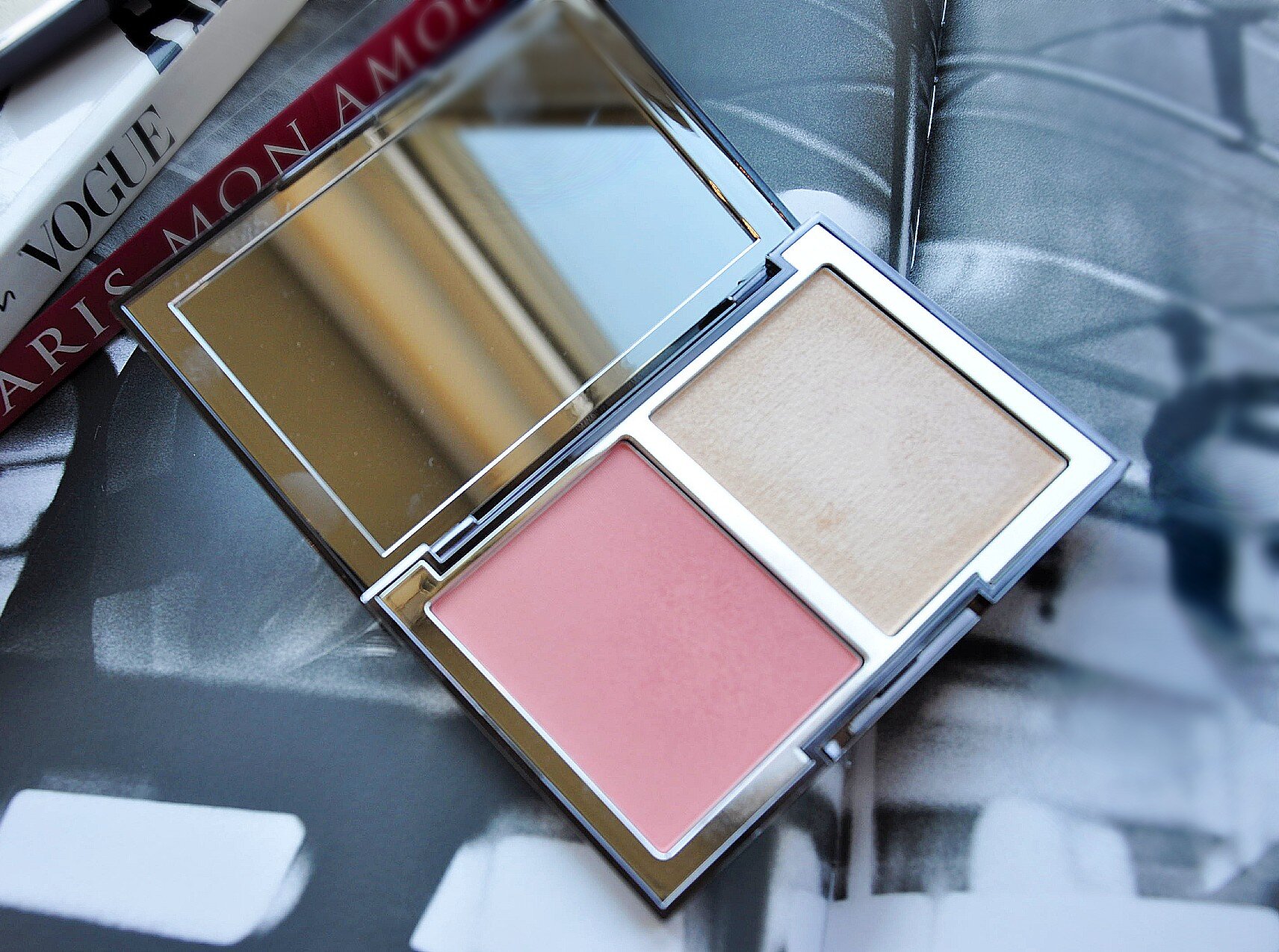
Coral Rose
Blushing: This blush is a true pale peachy-pink. It looks very similar in a variety of light situations and is neither too cool nor too warm in undertone. The color may appear opaque in the pan but it goes on in a slightly more sheer way compared to the other two palettes I tried. I think this would look good on a lot of different skin tones.
Rosy: This is a light-medium gold highlighter that leans warm. The highlighters were all a little hard to swatch because their true effect when worn on the face is a little different than how they swatch on my wrist. This one goes on like a soft metallic medium gold with a lighter gold shift.

Shocking: This is the blush that made me a little giddy with excitement when I first saw the color in the promo photos and later when I unboxed the palette. I confess I have an unusual penchant for bright pink blushes and this one is a true “shocking” pink. It’s bright, pigmented, and a brilliant shade of pink that leans neither warm nor cool -a perfect neutral shocking pink. And don’t be intimidated by this color - the blush formula ensures that it goes on lightly, and blends seamlessly. And in general, don’t be afraid of bright pink blushes - used with a light hand, they make my cheeks come alive.
Pearl: This highlighter is a true pale-gold. I find there are not a lot of pure pale-gold highlighters on the market. In my cavernous collection of gold highlighters, I have only a few that are truly pale-gold and this one now joins that crew.

In natural light, facing a window - from L to R: Blush Peony (blush + highlighter), Coral Rose, Vivid Azalea

Indoors, under a lamp - from L to R: Blush Peony (blush + highlighter), Coral Rose, Vivid Azalea
So there we have it - my quick review of Wayne Goss’s Weightless Veil Blush Palettes. It’s not just that I find this collection fabulous, it’s also that these have become everyday staples which, given the vast number of blush palette like products on the market, is truly saying something. But then again, I would have expected not a jot less of the wonderful Wayne Goss.

Clockwise from top-left: Blush Peony, Coral Rose, Vivid Azalea